Trauma-informed design in digital spaces

Emotional Design
At Modular we have always tried to take specific user needs and experience into consideration when designing websites, but until VOICES asked us to help build them a new website, we didn’t have a name for it. Now we know this is Trauma-informed Design.
As a relatively recent concept, no single definition has really been decided on yet. In essence, the framework of Trauma-informed Design takes the principles of trauma-informed care – the practice of taking a patient’s whole history into account when providing healthcare so as to be mindful of any past or current trauma – and applies them to design.These principles include: safety, trustworthiness, peer support, collaboration, empowerment and humility. The central goal is to respect the intended user’s lived experience.
When considering what we can incorporate into digital spaces from these principles, a few in particular were of the utmost importance in creating the new digital home for VOICES.
"We absolutely love our website and feel at last we have something that truly represents who we are and what we do as a charity. Modular were excellent to work with, matching technical expertise with good communication, creativity and empathy".
Safety
Both real and perceived, the safety of the intended user is paramount. The design should not endanger the user, nor make them feel they are at risk at any time. In the digital word this can often mean data should be handled extremely carefully and only collected if absolutely necessary.
In particular in this case we developed a way to quickly and safely exit the site and remove it from a person’s browser history. Just one click, from any page.
Trust
Information should be communicated clearly, consistently and with transparency. Trauma can arise from unpredictable circumstances and unpredictable designs will only cause distrust and potential confusion.
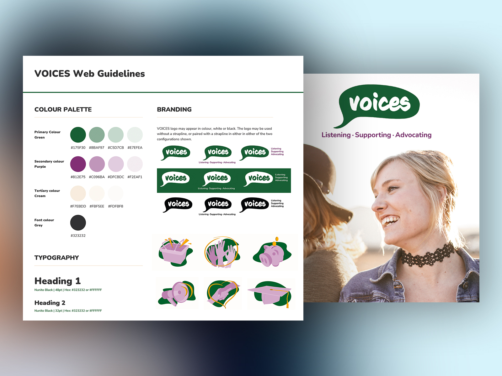
We designed every page with intent and clear direction. All content is linked with beautiful, hand drawn illustrations that not only lend consistency to every area of the site, they also help to reassure visitors and create a calm environment.
Empowerment
Those who have experienced trauma have often had their agency impaired in some way. When interacting with a design the user should feel empowered and in control. Avoid overwhelm by creating clear intent, but do not make the experience feel forceful or coercive. Likewise, the user should not feel they are encountering obstacles to acquiring information.
For this reason, different options should be considered when designing contact information pages and similar content. Attention was given to these areas of micro copy so that nothing on the site feels vague or confusing.
Everything leads neatly and clearly into the next step giving power to the user to make choices on how to access information.
Unique solutions, for unique needs
From decorative elements and illustrative images, to the microcopy on buttons, all visual and verbal elements can contribute to an effective trauma-informed design. With any of these principles the needs and solutions will differ depending on the intended user and the nature of their lived experience.
There is no one-size fits all.
Understanding the psychology of colour, current accepted terms and key phrases to avoid, helps to make informed decisions when designing. If in doubt, we were led by the client and their knowledge of the community we were designing for.
If you are supporting and helping others and would like to bring your service online or improve an existing online service, why not give our friendly team friendly experts a call to discuss how we can help in more detail? We'd love to be part of your project.


