Meeting the needs of visitors, commuters, a passionate marketing team, board of trustees and one mega iconic bridge, all in one single CMS website.

User centred, branded, CMS
The Clifton Suspension Bridge Trust needed to launch a CMS website that could handle high traffic and ever-developing user needs, while calling back to the innovation and history behind the stunning landmark. What they had was an unruly CMS, outdated visual identity and a labyrinth of convoluted user journeys that was damaging user experience.
"Modular were fantastic in supporting us through the process of design, testing and launch, as well as solving teething troubles as we added new and unanticipated forms of content during the 2020 lockdown".
Laying plans
The original website, commissioned in 2014, had previously ticked all their boxes. It wasn’t a bad website, but user and organisational needs had outgrown it. As new content and functions were added, the site got harder and harder to maintain.
One of the first things Modular had to do was decide which CMS would work best for The CSBT. At the time the site was hosted in Drupal, a popular CMS but one that requires a skilled content manager to edit due to its inflexibility and technical interface. The CSBT simply did not have the resources to make continuing with Drupal a viable option. They needed something that would make content easy to update quickly and look good straight out of the gate.
The solution? A bespoke CMS supported by WordPress. Using WordPress meant that there would be plenty of resources to utilise due to its community of developers, extra plugins and an existing framework of modules. Building on core components with new HTML and CSS helped achieve unique design elements and much needed functionality but kept content management as simple as possible.
A good foundation for CMS design
With the decision made to create a bespoke CMS, work started on clarifying the purposes and user journeys of the new site. The main problem facing users was finding the right pages to purchase crossing cards and book activities for visiting schools. Not only did the pages need to be resurfaced in a way that made them easy to navigate, new forms needed to be created to facilitate this. A lot of work went into making sure that the entire site was easy to understand and follow..
Paying Homage to brand
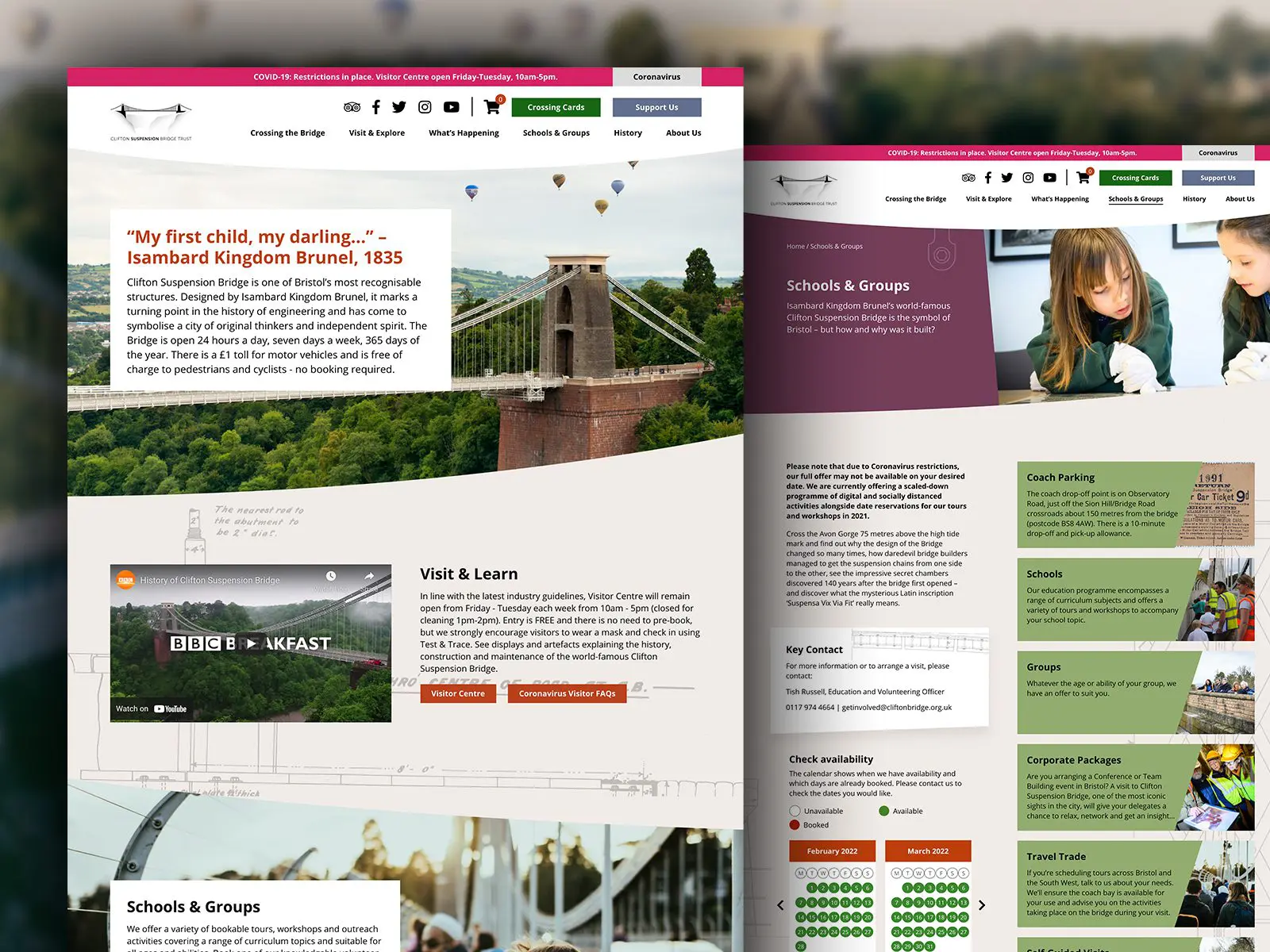
One thing that was very important to the team at CSBT was reflecting the elegant curves of the bridge in the new website’s design. We proposed a few different designs, but the curves of the bridge are an integral part of the CSBT brand, used in all marketing materials. A generic curve wasn’t going to cut it.
The long, sweeping curves you can see on the website today were designed by taking photos of the bridge from different angles. Our User Interface Designer Lauren Webb referenced these throughout each stage of design and build to make sure the vision for the site came to life. They are the exact curves you’ll see when crossing the bridge or looking at its silhouette across the gorge.
Paired with blueprints and engineering diagrams, these curves pay homage to the innovative design of Isambard Kingdom Brunel that characterises Clifton Suspension Bridge. That might sound straightforward, but this turned out to be one of the hardest aspects of the project. A senior HTML developer was called in and hours of work went into perfecting the curve designs, overlaying the blueprints and ensuring responsiveness across devices.
We think it paid off. Now, not only do users have a smooth, straightforward user journey throughout the site, the bridge is instantly recognisable in the branding. Just like the real thing, it feels sleek and well made, because it is.
If you are looking to improve your customer experience online, why not give us a call? After all, great projects often start with a great conversation.


